|
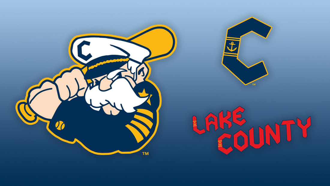
While the Guardians play in "The Land," their High-A affiliate, the Lake County Captains, proudly represent the water. On Tuesday, the team unveiled a refreshed nautical-themed look for 2025 and beyond, embracing their close proximity to Lake Erie and rich maritime heritage.
Based in the Cleveland suburb of Eastlake, the Captains have long celebrated their nautical identity. The team's previous primary logo featured the Captains' wordmark over a ship's steering wheel. Now, the captain himself takes center stage. This seasoned mariner has been a cornerstone of Lake County's branding since its inception in 2003. The new logo honors this history while introducing new design elements. "We started this process two years ago, doing a deep dive into the Lake County and Cleveland communities. We talked to fans to understand what they've always liked and how we can integrate it more," said Alan Miller, Captains owner and president. "We're bringing out the best of the past into a phenomenal new brand moving forward." The redesigned Captain now features a more expressive face, a bushier mustache, a baseball sleeve cuff, and a team-branded cap perched atop his weathered brow. The cap prominently displays the team's new "C" logo, which cleverly incorporates an anchor. "It speaks to who we want the captain to be, the attitude and the person," Miller explained. For now, the Captain remains nameless, with the team preferring to let his identity evolve organically. The updated look reflects the Captains' commitment to honoring their maritime roots while engaging with their community and fans. As they sail into the 2025 season, the Lake County Captains are set to make waves with their bold new branding.
0 Comments
Leave a Reply. |
Categories
All
|
